Complimentary white-glove delivery over $500

Designed in California · Made to order

Shop the collection

The Dingyu journal

Notes on living well.

Ideas for slower rooms, better materials and the small rituals that make a house feel like yours.

Writing from the studio
Manteca, California

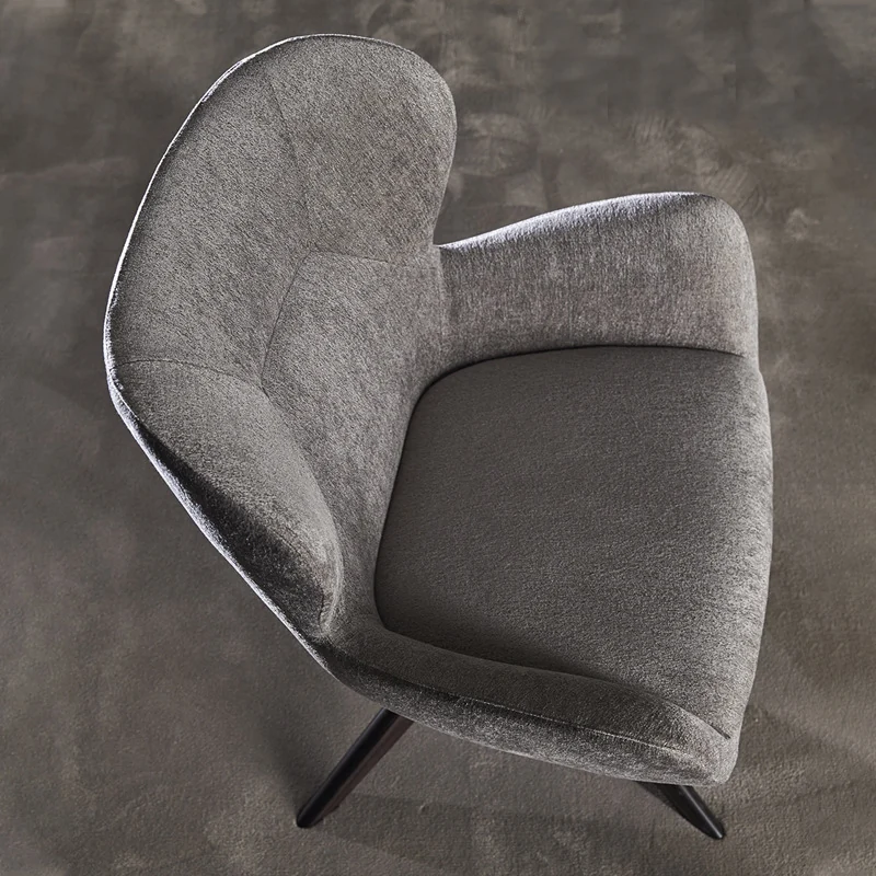
Aerie Wing Chair in fog grey wool

Featured · Design notes

The case for the reading chair.

Every room needs one chair that is not for the television, not for the dining table and not for guests. A chair that exists purely for the pleasure of sitting down.

Read the note

The case for the reading chair.

There is a particular kind of room that makes you want to stay. It rarely has the most furniture. More often, it has one chair placed with intention — near a window, beside a lamp, angled toward the garden rather than the screen.

A reading chair is a small act of architecture. It creates a room within a room. The high back of the Aerie Wing, for example, does more than look generous: it cuts the visual noise behind you, so the world narrows to a page and a pool of light.

When you choose one, start with the body rather than the colour. Sit for ten minutes, not ten seconds. Notice where the seat hits the back of your knee, whether your shoulders can drop, whether the arms are low enough to rest a book on. A chair that looks beautiful is a good start. A chair you can disappear into is the point.

Then give it room. A reading chair needs a little breathing space to feel deliberate — a side table for a cup, a lamp within reach, perhaps a footstool. Resist filling the rest of the corner. The emptiness is part of the invitation.

Soft geometry, hard edges.

Curves work best when they have something to push against. In a room full of straight lines, a rounded chair reads as a moment of release. In a room with too many soft edges, it can disappear entirely.

Our approach is simple: pair one generous curve with one crisp line. Set a Cloudform lounge against a rectangular window frame. Put the clean brass legs of Aurelia on a stone floor. Let the chair be the softest thing in the room, and let the room remain itself.

Scale matters more than colour. An oversized form needs space to be oversized; squeezed into a small corner, it simply looks crowded. If the room is tight, choose a piece with a smaller footprint and a taller back — it will give you the feeling of enclosure without taking up the floor.

And leave a little asymmetry. A pair of matching chairs facing a sofa is useful. A single sculptural chair, placed slightly off-centre, is memorable.

A palette from the valley.

Our first collection began with a colour walk. Not a mood board, but an afternoon in the Central Valley: the pale oat of dry grass, the hazel of walnut shells, the chalky grey of a winter sky, the red of a roadside sign.

Those colours found their way into the work. Oat bouclé. Hazelnut tweed. Parchment leather. A signal red leg, used sparingly. The palette is warm but not sugary; it has enough earth in it to sit comfortably beside wood, stone and the particular light California gets in late afternoon.

Texture does the rest. A flat colour can feel lifeless in a large piece, which is why we lean toward surfaces with a little irregularity: the loop of a bouclé, the fleck of a tweed, the natural grain of aniline leather. These materials change across the day. In the morning they are quiet; in the evening, they seem to hold the light.

If you are building a palette from scratch, start with the floor and the largest piece of furniture. Add one texture, one metal and one thing that makes you smile. Stop there. A room does not need a complete story on the first day.

Find your own reading chair.

Twenty-seven forms, made to order in California. Browse the collection or ask us for a considered edit.

Shop the collection Ask the studio